
Landing page examples
Call to Action Examples That Turn Visitors Into Leads
See call to action examples for lead generation, with button text data, structures to copy, and mistakes that cost conversions.
Call to action examples work best when they remove guesswork. A good call to action tells a visitor what they will get, what to do, and what happens after they click. Use the examples and samples below to write clearer buttons for landing pages, ads, emails, and lead forms.
Leadpages data
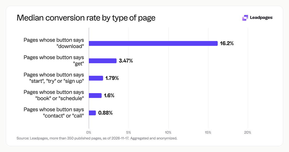
Form conversion rates for pages published with Leadpages, by what the button says, over the 90 days to 2026-11-16. A form conversion rate is the share of visits to a page in which the visitor submitted its form. Each figure is a median or quartile across pages. It describes the pages in a group, not what causes the difference between groups.
more than 350 published pagesAs of November 17, 2026
3.47%
Median form conversion rate, pages whose button says "get"
1.79%
Median form conversion rate, pages whose button says "start", "try" or "sign up"
1.6%
Median form conversion rate, pages whose button says "book" or "schedule"
| Measure | Value |
|---|---|
| Median form conversion rate, pages whose button says "get" | 3.47% |
| Median form conversion rate, pages whose button says "start", "try" or "sign up" | 1.79% |
| Median form conversion rate, pages whose button says "book" or "schedule" | 1.6% |
| Median form conversion rate, pages whose button says "download" | 16.2% |
| Median form conversion rate, pages whose button says "contact" or "call" | 0.88% |
Median form conversion rate, pages whose button says "get"
Median form conversion rate, pages whose button says "start", "try" or "sign up"
Median form conversion rate, pages whose button says "book" or "schedule"
Median form conversion rate, pages whose button says "download"
Median form conversion rate, pages whose button says "contact" or "call"
Based on more than 350 published pages. As of November 17, 2026.
What a call to action has to do
A call to action is the instruction that turns a visitor into a lead or buyer. It may be a button, a link, or a short line of text. Its job is to make the next step obvious and worth taking, not to be clever.
This quick process gives you a working call to action:
- Name the one action that matters on the page. For a lead magnet, that action is usually a download. For a service business, it is usually a booking or a call.
- Write the button text as a verb plus the thing the visitor gets. "Get the checklist" is clearer than "Submit."
- Place the button after a specific value message. The visitor should know what they are getting before they see the ask.
- Remove competing actions that are not the page goal. If the page is for a free consultation, do not also push a newsletter signup at the same weight.
Examples of a call to action:
- Download the cheatsheet
- Get my free estimate
- Book a 15-minute call
- Start my free trial
- Save my seat
- Send me the pricing guide
These call to action examples share one thing: they use a verb and name the outcome. A button that says "Learn more" tells people to do something, but it does not say what they get.
The parts of a call to action that matter most
Button text
Button text is the strongest signal on the page. Across pages published with Leadpages, median form conversion rates varied by what the button said.
- Pages whose button says "download" had a median form conversion rate of 16.2%.
- Pages whose button says "get" had a median of 3.47%.
- Pages whose button says "start", "try" or "sign up" had a median of 1.79%.
- Pages whose button says "book" or "schedule" had a median of 1.6%.
- Pages whose button says "contact" or "call" had a median of 0.88%.
These are medians across page groups, not a promise for your page. The pattern likely reflects the offer and the commitment level, not the word alone. A download gives the visitor a specific item. A contact or call asks for a conversation without a clear deliverable. If you use "contact", pair it with a reason, such as "Get a quote" or "Book a free review".
Words around the button
The button does not work alone. The headline, subhead, and supporting line need to say what the visitor gets and why it is useful. A good supporting line removes risk. For a dental practice, the button might say "Book my free exam". The line under it can say "No cost, no insurance needed, and a confirmation in your email."
Visual weight
The button should be easy to see. Use a color that contrasts with the background, leave white space around it, and keep it above the fold on mobile. If the page has a form, keep the button close to the fields.
One action per page
A page with several equally weighted calls to action gives the visitor more choices and more chances to leave without acting. Pick one main action. Use secondary links sparingly, such as a small link to log in or learn more.
A call to action structure you can copy
Use this structure for a landing page or lead form:
- Headline that names the outcome.
- One line that says who the offer is for or what is inside.
- A button with a verb plus the thing.
- A supporting line under the button that removes a worry.
One call to action example for a real estate agent running paid search ads:
Headline: "Find out what your home is worth in the current market" Line: "Get a local agent's pricing report based on recent sales near you." Button: "Get my home value estimate" Supporting line: "Free report. No obligation. Sent by email."
Example for a fitness studio:
Headline: "Book a free 20-minute intro session" Line: "Meet a coach, see the space, and get a plan for your first month." Button: "Book my free session" Supporting line: "No membership required."
Example for a SaaS product:
Headline: "Try the inventory dashboard free for 14 days" Line: "Track stock, orders, and low-stock alerts in one place." Button: "Start my free trial" Supporting line: "No credit card required."
These call to action examples follow the same pattern. The button text alone is not the whole idea. The headline sets the value, and the supporting line handles the hesitation.
If you need call to action ideas, start with these verb and offer pairs:
- Download: template, checklist, report, guide
- Get: quote, estimate, plan, score
- Book: consultation, demo, session, table
- Start: trial, membership, assessment
- Save: seat, spot, time
Mistakes that cost call to action conversions
- Vague button text. "Submit", "Continue", and "Click here" do not tell visitors what happens. Change "Submit" to "Send me the checklist".
- Asking before giving value. If the page does not explain the offer, the button will not save it. Write the value message first.
- Too many competing actions. A page that asks for a demo, a newsletter signup, and a phone call in the same space splits attention. Choose one main action.
- Hidden commitment. If the button says "Start free trial" but the form asks for a credit card, the visitor feels tricked. Say what happens after the click.
- Placing the button only below the fold. On mobile, many visitors never scroll. Put the main button where they can see it without searching.
- Ignoring mobile. Test the page on a phone. The button should be large enough to tap, and the form should be short enough to finish in under a minute.
A concrete example: a consultant used "Contact us" on a page selling a strategy session. The page had no clear deliverable. Changing the button to "Book my free 30-minute audit" and adding a supporting line "You will leave with a one-page action plan" made the ask specific. That kind of change is a better use of time than changing button color.
Build your call to action
Write the offer first. Then write the button text. Then draft the headline and supporting line. Then build the page.
To do this in Leadpages, start with a call-to-action generator. Enter your offer and the tool gives you button text ideas. Draft your headline and check it with the free headline analyzer. Build the page in the landing page builder or use the AI page builder to get a draft fast.
When you have two button texts you like, run an A/B test. Use the A/B test significance calculator to see whether the result is reliable. Check the page with the landing page analyzer before you send traffic.
How we measured this
The button text figures above come from Leadpages data. The sample is more than 350 published pages, aggregated and anonymized, as of 2026-11-17. The scope is form conversion rates for pages published with Leadpages, by what the button says, over the 90 days to 2026-11-16. A form conversion rate is the share of visits to a page in which the visitor submitted its form. Each figure is a median or quartile across pages. It describes the pages in a group, not what causes the difference between groups.
The fastest way to apply these call to action examples is to start from a layout built for a specific goal. Browse templates to start from a landing page layout built for your offer, then adjust the button text and supporting copy.