
Landing page examples
Landing Page Examples That Convert (and Why They Work)
Browse landing page examples and see which elements drive conversions. Get landing page inspiration and ideas you can adapt for your business.
Leadpages data
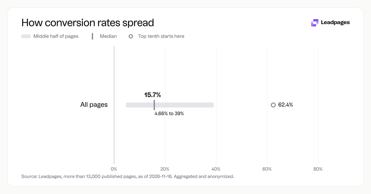
Conversion rates for pages published with Leadpages, by industry and page type
more than 13,000 published pagesAs of November 16, 2026
15.7%
Median conversion rate, all pages
4.66%
Bottom quarter converts below, all pages
39%
Top quarter converts above, all pages
| Measure | Value |
|---|---|
| Median conversion rate, all pages | 15.7% |
| Bottom quarter converts below, all pages | 4.66% |
| Top quarter converts above, all pages | 39% |
| Top tenth converts above, all pages | 62.4% |
| Share converting at 10% or better, all pages | 59.9% |
Median conversion rate, all pages
Bottom quarter converts below, all pages
Top quarter converts above, all pages
Top tenth converts above, all pages
Share converting at 10% or better, all pages
Based on more than 13,000 published pages. As of November 16, 2026.
You’re looking for landing page examples that actually work—landing page inspiration you can swipe, tweak, and use. This page shows the ideas for landing pages that win leads instead of bouncing visitors. You’ll get a clear structure, the parts that matter most, and a practical way to build yours.
Each landing page idea here comes from real patterns, not theory. Use these landing page examples as a shortcut: study how the best pages structure their message, and you’ll waste less time guessing.
What a landing page needs to accomplish
Every example landing page you’ll study does one thing well: it focuses a visitor’s attention on a single action. A landing page isn’t a homepage, a blog post, or an about-us page. It’s a destination after a click from an ad, email, or social post—and its job is to move someone from “interested” to “I’ll give you my information.”
Whether you’re collecting email addresses, registering webinar attendees, or selling a limited-time offer, the page cuts distractions. Navigation menus, competing offers, and unrelated content disappear. What remains is a tight story: here’s what you get, why it matters, and how to claim it.
When you browse inspiration landing page collections, look for that focused simplicity. The strongest inspiring landing pages serve one audience, one offer, one goal.
The elements that determine performance
Through analyzing actual landing page examples, a clear pattern emerges. The pages that perform best don’t rely on tricks. They nail five fundamentals.
Headline and subheadline. The first line has to match the promise that brought the visitor there. A vague headline like “Welcome to Our Platform” wastes attention. A specific one like “Start your free 7-day meal plan” confirms they’re in the right place and shows what’s next.
Hero image or video. A relevant visual anchors the offer—product shot, screenshot, or short explainer video. It reinforces the headline instead of repeating it.
Short, scannable copy. People scan landing pages. Bullet points, bold phrases, and short paragraphs carry the value without burying it.
A single call to action. High-converting landing page examples use one clear button or form. No “learn more” links or secondary offers. The CTA uses action language: “Get the checklist,” “Save my seat,” “Start free trial.”
Social proof. Testimonials, logos, review counts, or a short quote from a real user build trust. Even one relevant quote boosts credibility.
These elements come from studying real landing pages—and from our own data. Across pages published with Leadpages, the median conversion rate is 15.7%. The top quarter of those pages converts above 39%, and the top tenth converts above 62.4%. At the other end, the bottom quarter converts below 4.66%. Small differences in how you treat those five elements can move a page from the low end into the group of inspiring landing pages that win an impressive share of visitors.
A repeatable landing page structure
If you want a landing page idea you can use now, follow this sequence. You’ll see variations across landing page examples, but the core flow stays the same.
- Main headline and supporting subheadline. State the offer and its biggest benefit. Keep it to one or two sentences.
- Hero visual. Show a product image, a person using the result, or a clean screenshot of what they’ll get.
- Key benefits in three to five bullet points. Each bullet addresses a problem or desire. Lead with outcomes, not features.
- A trust block. Place a short testimonial, a review rating, or a “used by” logo strip right after the benefits.
- The conversion form or button. For lead generation, ask for name and email only—or what you truly need. Make the button copy specific.
- A closing reassurance line. Just below the form, add a small phrase like “No spam, unsubscribe anytime” or “We’ll send the guide within 2 minutes.”
Simple doesn’t mean plain. Even minimal landing page inspirations follow this structure. The creativity is in your words, your visuals, and how tightly you align the offer to what your audience wants.
(If you already have a page, run it through our landing page analyzer to see how it scores against these principles.)
Conversion mistakes to avoid
You can borrow all the landing page ideas in the world, but a few common missteps still drag results. Avoid these, and you’ll move closer to what top performers achieve.
Mismatched message. If your ad says “Download the free SEO checklist” but the page headline reads “Welcome to Our Marketing Blog,” people feel misled and leave. Always match the click promise to the page. This is the most frequent gap in landing page examples that fail.
Too many links. Every extra link—privacy policy, footer menu, social icons, a “read more” link—invites a click away. Remove anything that isn’t the primary CTA. Inspirational landing pages don’t leak attention.
Weak or absent social proof. A strong offer with no evidence strains credibility. Even a single sentence from an actual user helps. Use a call-to-action generator to pair your proof with action language.
Long or intimidating forms. If you ask for a phone number, company size, and job title just to get an ebook, you’ll shed conversions. Start with the smallest ask possible, then gather more data later.
Forgetting mobile. Many landing page examples look sharp on desktop but crumble on a phone. Design mobile-first so your headline reads well, your image scales, and your button stays thumb-friendly.
Small fixes here compound fast. Across pages published with Leadpages, the bottom quarter converts below 4.66% while the top quarter converts above 39%. Addressing even two or three of these issues often drives that kind of improvement.
Build yours
Studying landing page inspirations is a strong start, but the real progress comes when you build. You don’t need a design background or a development team. Start with a proven template, then customize it to match your offer and audience.
A few steps to move from idea to live page:
- Pick a template from a library of mobile‑responsive landing page designs. Browse the template gallery to find a starting point that fits your goal—lead capture, webinar registration, or a simple coming‑soon page.
- Write your headline, benefits, and CTA in clear, benefit‑driven language. If you’re stuck, the headline analyzer gives you a score and suggestions in seconds.
- Add your image or video, testimonials, and a single form. Leadpages’ AI page builder can generate a complete first draft based on your offer, which you can then refine.
- Publish and connect the page to your ad campaign or email list. When you’re ready to improve, use the built‑in A/B testing to compare versions and let data guide decisions.
Every inspirational landing page you’ve admired follows the same cycle: build, test, learn, refine. The fastest path to a page that works is to stop comparing and start publishing.
Note on the data: The conversion figures in this article come from our own data across pages published with Leadpages. Aggregated and anonymized; more than 13,000 published pages; as of 2026-11-16.