
How-to guides
Call to Action: How to Write One That Converts
Learn how to write a call to action that converts visitors into leads. Step-by-step guide with real data from over 13,000 landing pages. No fluff.
Leadpages data
Conversion rates for pages published with Leadpages, by industry and page type
more than 13,000 published pagesAs of November 16, 2026
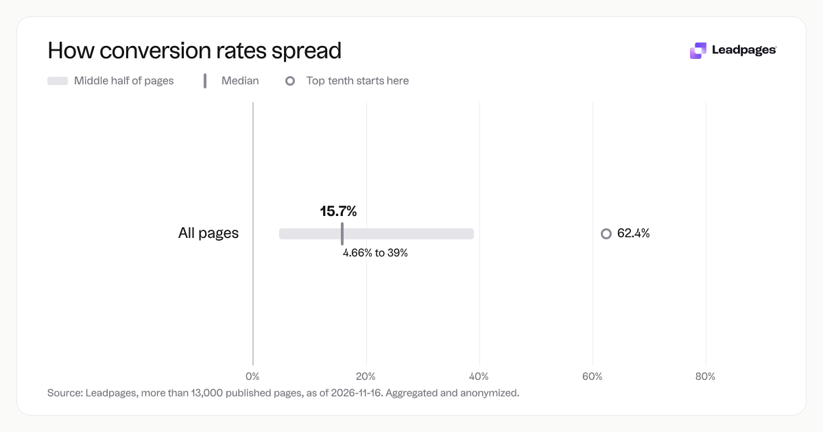
15.7%
Median conversion rate, all pages
4.66%
Bottom quarter converts below, all pages
39%
Top quarter converts above, all pages
| Measure | Value |
|---|---|
| Median conversion rate, all pages | 15.7% |
| Bottom quarter converts below, all pages | 4.66% |
| Top quarter converts above, all pages | 39% |
| Top tenth converts above, all pages | 62.4% |
| Share converting at 10% or better, all pages | 59.9% |
Median conversion rate, all pages
Bottom quarter converts below, all pages
Top quarter converts above, all pages
Top tenth converts above, all pages
Share converting at 10% or better, all pages
Based on more than 13,000 published pages. As of November 16, 2026.
A call to action tells visitors exactly what to do next—sign up, start a trial, get the guide. Without a clear CTA, even a strong page leaves people guessing. The ask often makes the difference between a page that converts and one that doesn’t.
Across pages published with Leadpages, the median conversion rate is 15.7%. The top quarter of pages converts above 39%, and the top tenth above 62.4%. That spread shows how much the right approach can move the needle. A well-crafted call to action is one of the highest-leverage fixes you can make.
The short answer: one clear ask, one clear benefit
A good call to action removes uncertainty and ties the click to a benefit. "Submit" is a button label. "Get my free SEO checklist" tells people what they’ll get and why to click.
Use a simple formula: [verb] + [what they get] + [time or effort hint]. For example, "Download the guide now" or "Start your free trial in 2 minutes." The verb is active, the benefit is concrete, and the effort feels low.
That’s the core. But getting it right takes more than a catchy phrase. Placement, design, surrounding copy, and limiting choices all matter. The steps below break it down.
How to create a high-converting call to action, step by step
When you build a landing page or a key site page, treat the CTA as the centerpiece. Everything else should support it. Here’s how to build one that works.
Step 1: Start with the one action you want
Before you write a word, decide what the page is for. Is it lead generation, a webinar registration, or a trial signup? Choose one primary goal. The CTA must match that goal exactly.
Pages with a single, focused ask almost always beat pages with multiple equal CTAs. If you need a secondary option—like a link to learn more—make it visually secondary, such as a plain text link or a lighter button.
Step 2: Write the button copy like a micro-pitch
Your button text matters. Skip generic labels like "Submit," "Click here," or "Learn more." Use a verb that describes the specific action and what follows.
- Bad: "Get started" (vague, no benefit)
- Better: "Start my free 14-day trial" (specific, ownable)
- Even better: "Start my free trial and get the first template free" (adds an incentive)
A free CTA generator can spark ideas. Keep the principle simple: make the button complete "I want to…" and show the personal gain.
Step 3: Make the CTA stand out on the page
Placement and visual hierarchy matter as much as copy. Your CTA should be the most noticeable element in the viewport. Use a color that contrasts with the rest of the page—often a warm tone on a cool background, or the reverse. Give the button breathing room with white space.
On mobile, show the CTA early and keep it easy to tap. A sticky button that stays visible as the user scrolls can lift conversions, especially on long pages.
Check your page with a landing page analyzer to see how your CTA’s visibility stacks up. The free tool scores layout, copy, and call-to-action prominence.
Step 4: Align everything else to support the ask
Your headline, images, bullets, and testimonials should point to the same goal. If your headline promises "The only project management tool you'll ever need," but your CTA says "Sign up for updates," that’s a disconnect. The headline sets the promise; the CTA delivers it.
Make the section above the CTA lead naturally into the ask. If you just listed features, end with a single, benefit-first line like "Start delivering projects on time—no spreadsheets needed." Then place the button right after.
Step 5: Reduce friction around the action
Every extra field or fuzzy label adds friction. For lead gen CTAs that open a form, keep it short. Name and email is often enough. If you need more info, ask after the first conversion, not before.
Also check for micro-frictions: a button that looks disabled, copy that reads like a commitment ("Buy now" vs. "Try free for 7 days"), or a missing privacy note. Add a short line under the button like "No credit card required" or "We’ll never share your email." These quiet reassurances help hesitant visitors act.
Step 6: Test the CTA in a real page
You only know what works by testing. Small changes—button color, wording, placement—can shift conversions. Run an A/B test that changes only the CTA element you’re testing.
Use a simple A/B test calculator to check if your results are statistically significant before you pick a winner. And keep going. Across pages published with Leadpages, the top tenth converts above 62.4%; results like that come from steady experimentation, not one perfect guess.
Common CTA problems that hurt conversions
Even experienced marketers fall into patterns that weaken a call to action. Here are the common issues—and fast fixes.
The CTA asks for too much, too soon
A "Request a demo" button on a cold-traffic page is a heavy ask. Most visitors aren’t ready for a sales call. Offer a lower-commitment step first, like downloading a case study or trying a free tool. Once they engage, ask for more.
There are too many choices on the page
When you give multiple CTAs equal weight, you split attention. Decision paralysis is real. If you must include a secondary path—like a "Learn more" link—make it a simple text link, not a competing button. The main CTA should be the obvious next step.
The copy is clever but unclear
"Unluck your potential" sounds nice but doesn’t tell anyone what happens next. Clarity beats clever every time. "Get my free copywriting tempates" is plain, but it converts because people know exactly what they’ll get. Run your button text past a few colleagues and ask, "What do you think you’ll get?" If answers differ or take too long, simplify.
The CTA doesn't match the traffic source
If an ad promises a free e‑book, the landing page headline and CTA must deliver that e‑book, not a newsletter signup. That’s message match. Any break between the ad, the page, and the CTA erodes trust. For paid social or search, use dedicated landing pages with button copy that repeats the ad promise.
The page lacks social proof near the CTA
Place a short testimonial or a stat like "Join 10,000+ marketers" (only if true and verifiable for you) near a signup button. This gives a final nudge. The promise of the CTA is stronger when people see others have taken the same step and benefited.
What to do next
Great CTAs come from a cycle of writing, observing, and refining. Start by auditing your highest-traffic page. Is there one clear CTA? Does the button state a specific benefit? Could a visitor scan and know what to do in three seconds?
Use these free tools to speed it up:
- CTA generator – get button copy ideas in seconds.
- Landing page analyzer – score your page’s CTA placement and copy.
- Headline analyzer – make sure your heading supports the CTA.
- A/B test calculator – know when your test results are real.
Then put your new CTA live. Even a small improvement can lift conversions. Across over 13,000 pages, the bottom quarter converts below 4.66% while the median is 15.7%—and a better CTA often moves a page from one group to the other. Start building pages with clear CTAs. Start building free.
A note on the data
The conversion figures in this guide come from an analysis of more than 13,000 published pages. Aggregated and anonymized; as of 2026-11-16. Scope: Conversion rates for pages published with Leadpages, by industry and page type.